Saturday, February 12, 2011

material studies


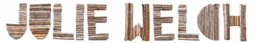
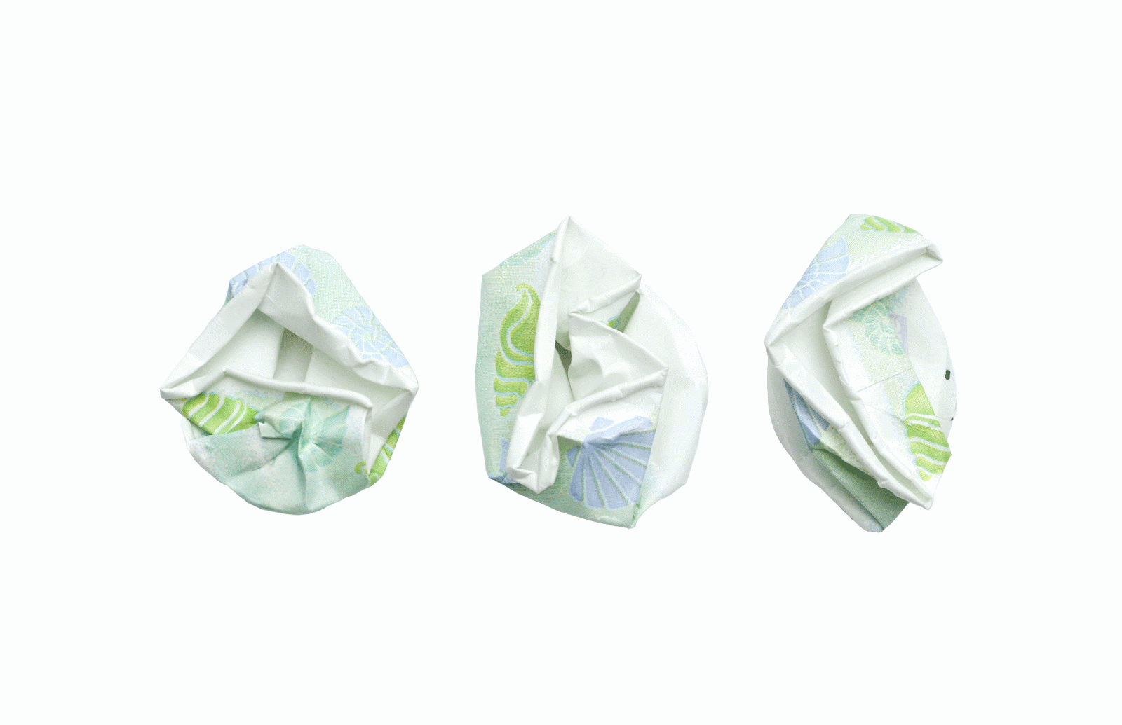
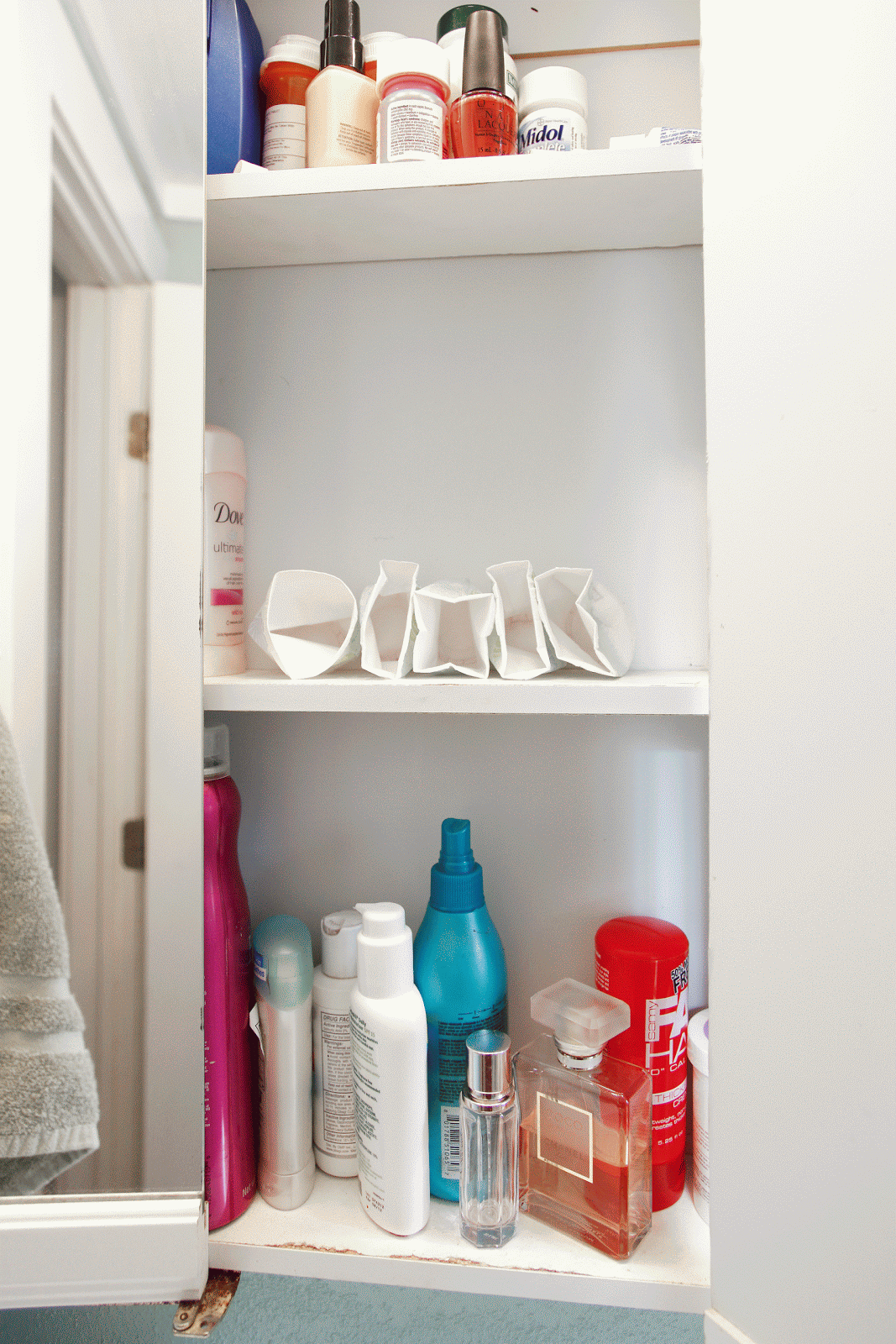
Since I love crafting and doing anything hands on, I really enjoyed the material studies assignment. We were told to create our own font using everyday materials. As opposed to choosing objects that are easily manipulated, the challenge was to find items that had a definite shape and create a nice, legible font. After we created this font we made a poster showcasing the font in an appropriate area, determined by which object you chose. After numerous studies I narrowed my choices down to dixie cups, twigs, and flowers. I had a hard time deciding between the twigs and dixie cups for my final poster but thought the cups were more interesting since they allowed for less freedom. I named my font "dixie" and photographed it in my bathroom cabinet. 

critical mass


My critical mass video revolves around the word evolution. Students were told to choose a scientific word and create an allegory for it. In my animation I use paint cans to represent this process. It shows different paint cans mixing together (reproducing) and creating a new color. At the end of my video all of the paint cans have changed from their original color.

scales


For the scales project we were told to imitate different design styles such as Constructivist, International, Pop Art, etc. We were given a list of questions that we had to answer through our designs and the focus was more on quantity rather than quality. This project helped us improve our photoshop skills and think of new ways to create interesting images.

scavenger hunt

The scavenger hunt was one of our first assignments in image methodology. The intent was to take six different photos that each connect to the one before and after it through the different elements of design. Photos 1 and 2: texture, 2 and 3: line, 3 and 4: shape, 4 and 5: color, 5 and 6: line. The final product resulted in a nice collection of unexpected but cohesive photos. 


type specimen book


The type specimen book is meant to showcase the different qualities of a chosen font, mine being ITC Garamond. I had a lot of fun making this book and finding a design that I could keep consistent throughout. In the end I designed 20 pages and created this bound book.

design culture now


For this project we were told to create a poster for an upcoming design conference highlighting four designers. The purpose was to focus on typographical hierarchy and placement. The bottom poster is my original final product from freshman year. I have since updated and refined the original idea. The top poster is the updated version.

prototype


For the prototype project students were told to create a typeface using only small squares and a 9x9 grid.
My typeface was called "missing square." 

illustrator exercise

This is one of the very first things I made in Illustrator. The assignment was meant to familiarize us with the pen tool and basic abilities of Illustrator.

personal geography


The personal geography assignment consists of three maps: artifact, perceptual, and cognitive. My artifact map (top) acts as a basic map of the route I take every morning from my house to school. This map is meant to be labeled and designed well enough so that someone could use this and successfully make it from point a to b. The perceptual map (middle) acts as a sensory guide for the same route as the artifact map. This documents my senses that are experienced and how they vary in intensity over time. The third and final map in this process is my cognitive map (bottom). This represents my thoughts and decisions in symbol form.

symbol interaction exercise


This interactive video is a follow up on the symbol methodology assignment. Students were told to choose one of their final symbols from the previous project and animate the creation process. This assignment helped me improve my flash skills and learn to explore new mediums to express my ideas.

symbol methodology


This project walked us through the process of creating a symbol. We first chose a certain industry, for example: agriculture. We then brainstormed at least 100 different words that defined this industry and narrowed them down to the three that we felt were important. Afterwards we went through multiple processes of creating, combining, and iterating images to produce interesting symbols that we would not have imagined originally. I enjoyed this project because I learned that good design ideas don't always come immediately and that sometimes certain processes can help your creativity when it's not at its peak.