Friday, December 2, 2011

image analysis

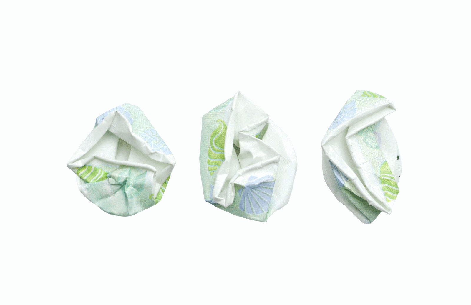
The image analysis poster was intended to help students identify different movements in design history that are still present today. We were told to choose some sort of current design piece and then dissect that piece of work and highlight its influences. 

octavo vs. mosaic


This paper compares octavo books to the mosaic web browser. We were supposed to choose two different creations, from different time periods, and then compare and contrast the two.

arts and crafts and the private press presentation


I chose to do my graphic design history presentation on the arts and crafts and the private press. I have always been drawn to this time in design and I feel like it has greatly influenced my style of design.

locating place: east austin book


The East Side is an emerging subculture of Austin that can be defined through its traditional community, mysterious atmosphere, and strong focus on art. This book focuses on two aspects that are associated with East Austin: art and trash. I  combined photos of found objects from around the area with graphic overlays, in hopes to repurpose and highlight these strange findings. My goal was to enhance the striking qualities of the objects and show how the two worlds can work together to create interesting collaborations that represent East Austin.

locating place: east austin video


For this project I decided to focus on the color palate of East Austin. I feel like that colors in the area are a major defining aspect of the culture. The video begins with small square photos of different places around East Austin. Those photos then transform into a color swatch of the dominating color of that photo. The color swatch then breaks out of its square, bleeding into the streets of East Austin. The black and white video in the background is a documentation of a typical street in the East Side. 

tasa book


The Tasa book was designed as a guide for an upcoming art conference at St. Edward's University. The challenge was managing such a large amount of text for a small book. The theme was "Art + Community" so I tried to play along with that theme by keeping the color palate neutral and combining speaker photographs with patterns of their work.

Saturday, August 20, 2011

youth art awards


This is a poster I designed for the 10th annual Youth Art Awards hosted by the Ah Haa School for the Arts. I was allowed to have free reign for the design of this poster so I decided to incorporate a tactile font that was appropriate for the event.

Wednesday, March 23, 2011

weather report


The weather report shows the weekend forecast for four cities in three different segments. Students were told to present this information in three ways, choosing between location, alphabet, time, category, or hierarchy (L.A.T.C.H.). I chose to begin with alphabet, transition into time, and finally end with location. The difficult task was transitioning from one segment to another while keeping all of the weather information on screen.

Monday, March 21, 2011

words in motion: order


This was a short assignment meant to re-familiarize us with After Effects. We chose a word and were told to animate it in a way that clearly defined it. My first word was increase and I showed this by gradually stacking the word on top of itself, increasing the saturation as they stack. My second word (below) is order. I showed this by creating a font made up of small squares. The squares appear in order from lightest to darkest.

words in motion: increase

blue squares


The blue squares assignment was a short exercise we did in class just before we started the word in motion activities. We were given an example that appears exactly like the one above and told to imitate the motion of the blue squares exactly. This assignment helped us become familiar with the basic motions that are possible when using after effects.

Monday, March 14, 2011

graphic design history: systems and series


The purpose of this project was to establish a visual format for continuity and identification. Students were told to design and produce a series of commemorative entrance buttons and accompanying explanatory poster for a hypothetical Graphic Design History Exhibition held at the Blanton. My buttons represent the Arts and Crafts movement and are inspired by the works of artists such as William Morris, Charles Voysey, and Owen Jones.

instructional design


For this assignment we were told to create a "how to" piece for a simple task (such as how to wash dishes). The challenge was to create instructions that were both aesthetically pleasing and graphically innovative. We had to decide who our target audience was and where they would find these instructions. My target audience was college students/roommates and they are meant to access this tutorial through a public site such as youtube. While most college students already know how to wash the dishes, they frequently "forget" to do them. Therefore, my instructional stop motion is meant to be more entertaining than informative and it plays off the idea that your dishes won't wash themselves. While my stop motion is not a straightforward set of directions, it runs you through the process of washing dishes in an unexpected and innovative way.

the kitchen of meaning


For the Kitchen of Meaning assignment we were given a list of words to choose from and subsequently design a poster that embodied the definition of that word. I chose to explore the word "melange" because I like the idea of mixing incongruent items together in a way that appears cohesive and smooth. Originally, I had a hard time focusing my design ideas because creating a design that is defined as a mixture or blend leaves a lot to be explored. From the beginning I knew that I wanted to create my own typeface and that is how my final poster transformed into what it is. I noticed that the typeface I created looked more like a group of varying shapes than actual letters. I then decided to play around with the shapes individually, stacking them on top of one another, flipping them around, etc. until I had created a whole page of what appears to be a mix of patterns. At first glance you may not realize that the pattern on the page is made up of the same shapes that spell out melange but I think that makes the poster more interesting.

beads


Lately I have not been able to stop browsing different blogs for cool DIY projects. I haven't had as much time as I would like to actually make any of the items I run across but I recently sat down and made this lamp-ish piece. I got the idea from DesignSponge but haven't had time to attach a light bulb to it. So for now this beaded object hangs above my sink. I'll find time to light it up eventually...

rugs

For my 3d design class we were told to make a rug using any method we wanted. After looking around on the internet I found different tutorials on "simple" ways to construct a rug. For this type of rug you have to braid 1-2 inch wide strips of fabric together, coil, and then hand stitch the coils together. The process is pretty time consuming but the end result is nice. The final result in the top picture. I enjoyed it so much that I decided to make another for my kitchen a year later.


Saturday, February 12, 2011

material studies


Since I love crafting and doing anything hands on, I really enjoyed the material studies assignment. We were told to create our own font using everyday materials. As opposed to choosing objects that are easily manipulated, the challenge was to find items that had a definite shape and create a nice, legible font. After we created this font we made a poster showcasing the font in an appropriate area, determined by which object you chose. After numerous studies I narrowed my choices down to dixie cups, twigs, and flowers. I had a hard time deciding between the twigs and dixie cups for my final poster but thought the cups were more interesting since they allowed for less freedom. I named my font "dixie" and photographed it in my bathroom cabinet. 

critical mass


My critical mass video revolves around the word evolution. Students were told to choose a scientific word and create an allegory for it. In my animation I use paint cans to represent this process. It shows different paint cans mixing together (reproducing) and creating a new color. At the end of my video all of the paint cans have changed from their original color.

scales


For the scales project we were told to imitate different design styles such as Constructivist, International, Pop Art, etc. We were given a list of questions that we had to answer through our designs and the focus was more on quantity rather than quality. This project helped us improve our photoshop skills and think of new ways to create interesting images.

scavenger hunt

The scavenger hunt was one of our first assignments in image methodology. The intent was to take six different photos that each connect to the one before and after it through the different elements of design. Photos 1 and 2: texture, 2 and 3: line, 3 and 4: shape, 4 and 5: color, 5 and 6: line. The final product resulted in a nice collection of unexpected but cohesive photos. 


type specimen book


The type specimen book is meant to showcase the different qualities of a chosen font, mine being ITC Garamond. I had a lot of fun making this book and finding a design that I could keep consistent throughout. In the end I designed 20 pages and created this bound book.

design culture now


For this project we were told to create a poster for an upcoming design conference highlighting four designers. The purpose was to focus on typographical hierarchy and placement. The bottom poster is my original final product from freshman year. I have since updated and refined the original idea. The top poster is the updated version.

prototype


For the prototype project students were told to create a typeface using only small squares and a 9x9 grid.
My typeface was called "missing square." 

illustrator exercise

This is one of the very first things I made in Illustrator. The assignment was meant to familiarize us with the pen tool and basic abilities of Illustrator.

personal geography


The personal geography assignment consists of three maps: artifact, perceptual, and cognitive. My artifact map (top) acts as a basic map of the route I take every morning from my house to school. This map is meant to be labeled and designed well enough so that someone could use this and successfully make it from point a to b. The perceptual map (middle) acts as a sensory guide for the same route as the artifact map. This documents my senses that are experienced and how they vary in intensity over time. The third and final map in this process is my cognitive map (bottom). This represents my thoughts and decisions in symbol form.